
It’s hard to look at Apple’s new “Liquid Glass” aesthetic and not think about Windows Vista, Microsoft’s much-maligned OS which also touted transparencies and glass-like effects as a bold new vision for computing. You can see the similarities between Apple’s UI and Vista’s “Windows Aero” design language everywhere, from the glassified app icons in iOS 26 and macOS Tahoe 26 which look a lot like VIsta’s glossy icons, to the transparent backgrounds used in drop down menus, which hearken back to VIsta’s transparent window borders. The key difference is that Apple is just doing it all better. (Sorry, not sorry, Windows fans.)
While Microsoft started off with an intriguing idea, it failed to execute the Windows Aero UI well in Vista. Mostly, that’s because Vista itself was a huge mess — it was far slower than Windows XP, it was notoriously buggy and it handled drivers poorly. And if you actually wanted to partake in the glory of Aero transparency bars, you needed a computer with a powerful GPU. That was far more rare in 2007 than it is today, when even integrated graphics can run basic 3D and fancy UI elements well. With its homegrown chips, Apple also provides decent graphics capabilities in its devices that support iOS 26, iPadOS 26 and other new software releases with Liquid Glass.
It also helps that Liquid Glass isn’t really a huge change for Apple, unlike the jump from Windows XP to Vista. Apple has been creeping towards a flashier UI and more widespread use of transparencies ever since iOS 7 was released in 2013, which dropped the archaic skeuomorphic design trend in favor of a flatter and more stylish aesthetic. So sure, your icons and menus may have a bit more shine to them in iOS 26, but they mostly work the way you remember. (You could also argue Apple itself kickstarted the move towards transparencies in desktop operating systems with the original Mac OS X in 2001, which gave its iconic dock a glossy background.)

I can argue for the overall wisdom of Apple’s Liquid Glass, at least compared to Windows Vista, and personally I also think it gives iOS a much-needed dose of personality. But I can’t really convince you otherwise if you think it looks ugly, as many of my Engadget colleagues do. Senior News Editor Avery Ellis calls it “busy and obnoxious,” and Editor-in-Chief Aaron Souppouris noted that “it truly feels like Aero, rooted in the mid ’00s…. I don’t need light refracting around my pause button.” Fair complaints! And as usual, you can also reduce transparency effects and motion elements in Apple’s Accessibility Settings, if these elements truly bother you.
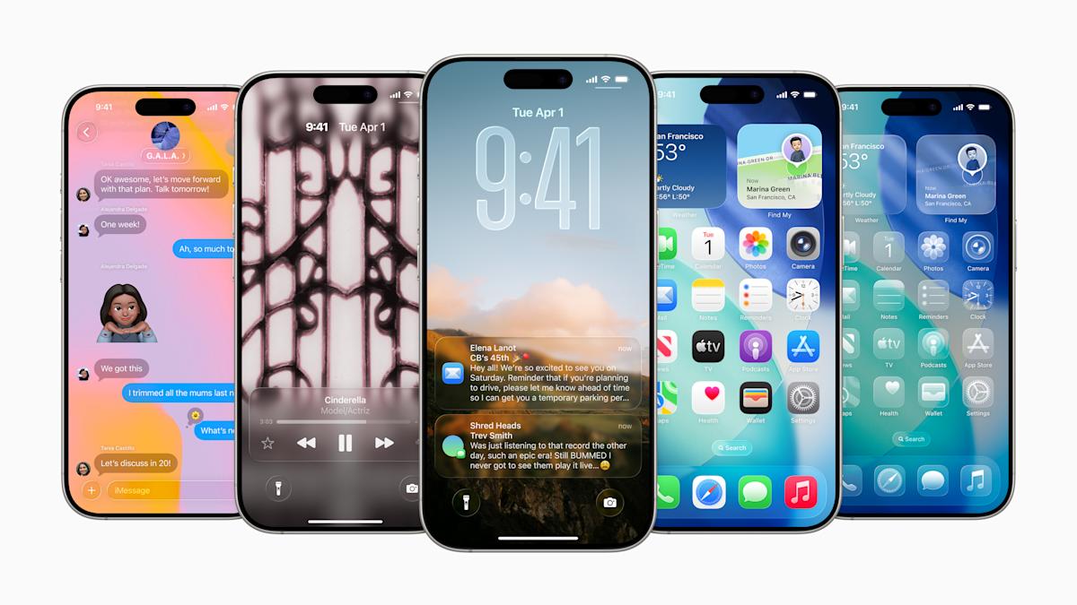
But after spending a bit of time with the first iOS 26 developer beta, I’m more intrigued by Liquid Glass than anything else. It makes app icons look like tiny jewels that I just want to touch, and I dig the transparency effects throughout the OS — they almost seem like a preview for a future where we’re using holographic Apple devices. (That’s also something I felt while using visionOS on the Vision Pro, which served as the launchpad for Liquid Glass.) I also genuinely love iOS 26’s revamped Safari, which lets you browse completely in full screen. As you scroll down, the location bar at the bottom of your screen shrinks and gets out of the way. But if you scroll up or tap into the location bar, it pops back up to give you the sharing and navigation options you’re used to.

It could also be that I’m a sucker for novelty. Back in my Windows XP days, I used to use apps like WindowBlinds to customize the OS and add transparent effects. And there are signs that Apple may be going a bit too far with transparencies, like with the iOS 26’s Control Center (above). It looks fine if you’re swiping it down while inside an app, but if you’re on the home screen, it’s just one of many levels of glass-like windows. I could see that being a bit overbearing for some users.
It’s also worth noting that interface redesigns are often rejected at first glance, especially since you’re seeing them abstracted through screenshots and videos. Even Apple’s slick marketing magic doesn’t replicate the experience of using Liquid Design. In my experience, iOS 26 really isn’t that different from everything that came before. Once you get over the initial shock of a new interface, you may see it with new eyes.
There’s also still plenty of time until Apple’s new operating systems arrive this fall though, and the company is often quick to tweak major design changes if beta users complain about them. I could see Apple toning down the Control Center’s transparent background, or even better, giving users more control over the amount of Liquid Glass elements on your screen. Personally, I don’t mind it when companies stretch their interface ideals a bit too far – there’s always room to move back. That’s far better than being too conservative and never really pushing your aesthetic vision forward.